Famous Logos in CSS3 – The Dark Knight
 As requested, I’ve decided to follow up last week’s post (within which we re-created the Batman logo with CSS3), with the Batman logo used in the new films.
The shape is simpler and easier to achieve than the original Batman logo so in order to ensure further progression in this series I’ve added a couple of extras such as CSS3 gradients and box shadow – just to make sure we’re touching on something we haven’t looked at so far in the series.
Take a look at the demo…

Browser Support
Browser support for this logo is rather similar to last weeks original Batman logo, with the most recent major browser releases coping very well, with the almost expected exception of IE9. Microsoft’s latest release is a big improvement but it still appears to have a bit of catching up to do.

Again I have made use of the :before and :after pseudo-selectors in order to minimise the number of divs and this is again where IE9 has broken down. I explain these pseudo-selectors in much greater detail in last weeks post, but basically, IE9 has trouble recognising certain CSS properties such as border-radius when using :before and/or :after.
IE8 has of course made a pathetic attempt to render the logo correctly – I’ve just included it for comedy value I guess.
How does it compare?
I think the shape is pretty close to the actual logo, but on closer inspection there are a few elements which I feel could be improved. It needs to be slightly taller and the tail section needs to be sharper.
The main area for the improvement though is the colouring; I feel it is certainly possible to get very close to the lighting on the actual logo using CSS3 gradients with multiple ‘stops’. However I’m no expert in CSS3 gradients and I will confess to using a generator for this particular example! Hopefully this is an area we will see some development in when tackling more CSS3 logos in the coming weeks.
The Code
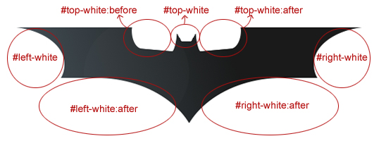
The basic shape can be structured using just 4 div elements like so:
<div id="batman-logo">
    <div id="left-white"></div>
    <div id="right-white"></div>
    <div id="top-white"></div>
</div>
Then we can use the pseudo-selectors to create some pseudo elements!
The CSS3
Again we’re using the border-radius property to create eliptical shapes and we’re making use of the transform property in order to rotate and position the shapes correctly.
#top-white {
    width:12px;
    left:228px;
    border-left:12px solid transparent;
    border-right:12px solid transparent;
    border-top:20px solid #fff;
}

#top-white:before {
    content:"";
    position:absolute;
    width:65px;
    height:77px;
    background:#fff;
    border-radius:30px 10px 10px 30px / 80px 50px 50px 50px;
    top:-65px;
    right:18px;
    -moz-transform:rotate(5deg);
    -webkit-transform:rotate(5deg);
    -o-transform:rotate(5deg);
}

#top-white:after {
    content:"";
    position:absolute;
    width:65px;
    height:77px;
    background:#fff;
    border-radius:10px 30px 30px 10px / 50px 80px 50px 50px;
    top:-65px;
    left:18px;
    -moz-transform:rotate(-5deg);
    -webkit-transform:rotate(-5deg);
    -o-transform:rotate(-5deg);
}
CSS3 Gradients
The CSS required for gradients is pretty bulky but it’s also really flexible and relatively simple once you remember the syntax; which isn’t all that easy considering it differs between webkit and moz vendors.
background-image: -moz-linear-gradient(        /* Remember Browser specific prefixes! */
    left bottom,        /* Gradient start point (the angle) */
    rgb(72,84,92) 0%,        /* First colour and start point */
    rgb(25,26,26) 63%,        /* Second colour and start point */
    rgb(26,26,26) 86%);        /*Third colour and start point */
So first of all we declare the type of gradient (ensuring we include the vendor prefix) which in this case is -moz-linear-gradient. Then we state the angle, which is going from the bottom left to the top right, before finally declaring the colours to be used and the where they stop/start. Pretty simply really! It’s also worth noting that you can use hex colour codes rather than RGB values, but both work just the same.
CSS3 Box-Shadow
Finally, I added an extra div to experiment with some kind of lighting effect. I used border-radius to create a very subtle circle with a very low opacity value. I then used the box-shadow property to create a white blur around the circle. It’s not a great effect but it gives some idea as to the range of uses the box-shadow property can have.
#lighting {
    width:150px;
    height:150px;
    background:#fff;
    border-radius:75px;
    left:100px;
    top:-10px;
    opacity:0.02;
    box-shadow: #fff 0 0 70px;
    -webkit-box-shadow: #fff 0 0 70px;
    -moz-box-shadow: #fff 0 0 70px;
}
So that’s another logo re-created in CSS3 – the third in the series so far. As always, if you think you have a more efficient method to achieve my outcome, please post it in the comments section!

About Stephen Greig
Stephen Greig is a 25 year old Freelance Web Designer/Front-end guy, currently living in Nottingham, UK. Stephen is also the creator of messivsronaldo.net and author of CSS3 Pushing the Limits, a book on advanced CSS3. You should follow him on Twitter where he talks about the web, sports, music and swears a lot. Stephen's also on Google+ if that's more your bag.